ALL ABOUT LOWER THIRDS
- dk5499
- Feb 1, 2016
- 2 min read
Video Credit: Arbuckle Industries
Ah, lower thirds... the most overlooked and underappreciated part of corporate videos!
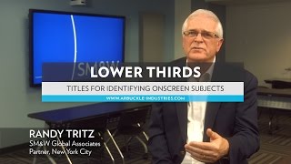
Lower thirds are graphics that show a person's name and job title. They are generally placed in the lower part of the frame, on the right or left side. The most important thing to keep in mind when designing these graphics is legibility. This means that both the font and the location need a little forethought. Ideally, we like to consider lower thirds before we hit the record button. It is a good idea to find a spot in the frame that is unobtrusive to the information in the background and does not awkwardly overlap your subject in the frame. This has become intuitive for us by now because we typically frame our interviewees on the right or left side of the frame anyway.
What about text? Simply tacking on Helvetica or Times New Roman can diminish the professional feeling of your video right from the start. So we take some time designing our lower thirds in Adobe Premiere or After Effects, depending on how animated we want them to be. This After Effects tutorial will teach you an expression that automatically resizes your lower third banner to fit any name you enter. Huge time saver! You could use this technique to create your own lower third template that can be easily placed into each video. If you're strapped for time and don't mind spending a few bucks, you can buy lower third templates on sites like Pond5. Many sites offer free ones as well.
When animating lower thirds, keep in mind that they're only briefly on screen, so don't get too wild with them or viewers might not have a chance to actually read them. You'll also want to create something that matches the mood and aesthetic style of the video. A standard corporate film might not call for a colorful, flowery graphic, but it doesn't mean it can't still be sleek and modern.
Lastly, keep in mind the length of the name and job title. Occassionally, a title might have to be shortened in order to fit on one line, or you can configure an aesthetically appealing way to put a job title on two lines without it looking too cramped. Just note that having too many lines can look messy and be hard to read. We recommend no more than three lines total. Lower thirds are on screen for only a few seconds, so while they're there you want them to add value to the film, not detract from it. Check out some of our examples above!


Comments